[Case 05]
A Usability-Led Redesign of the Hotel Listing Card
A Usability-Led Redesign of the Hotel Listing Card
A Usability-Led Redesign of the Hotel Listing Card
AT-A-GLANCE
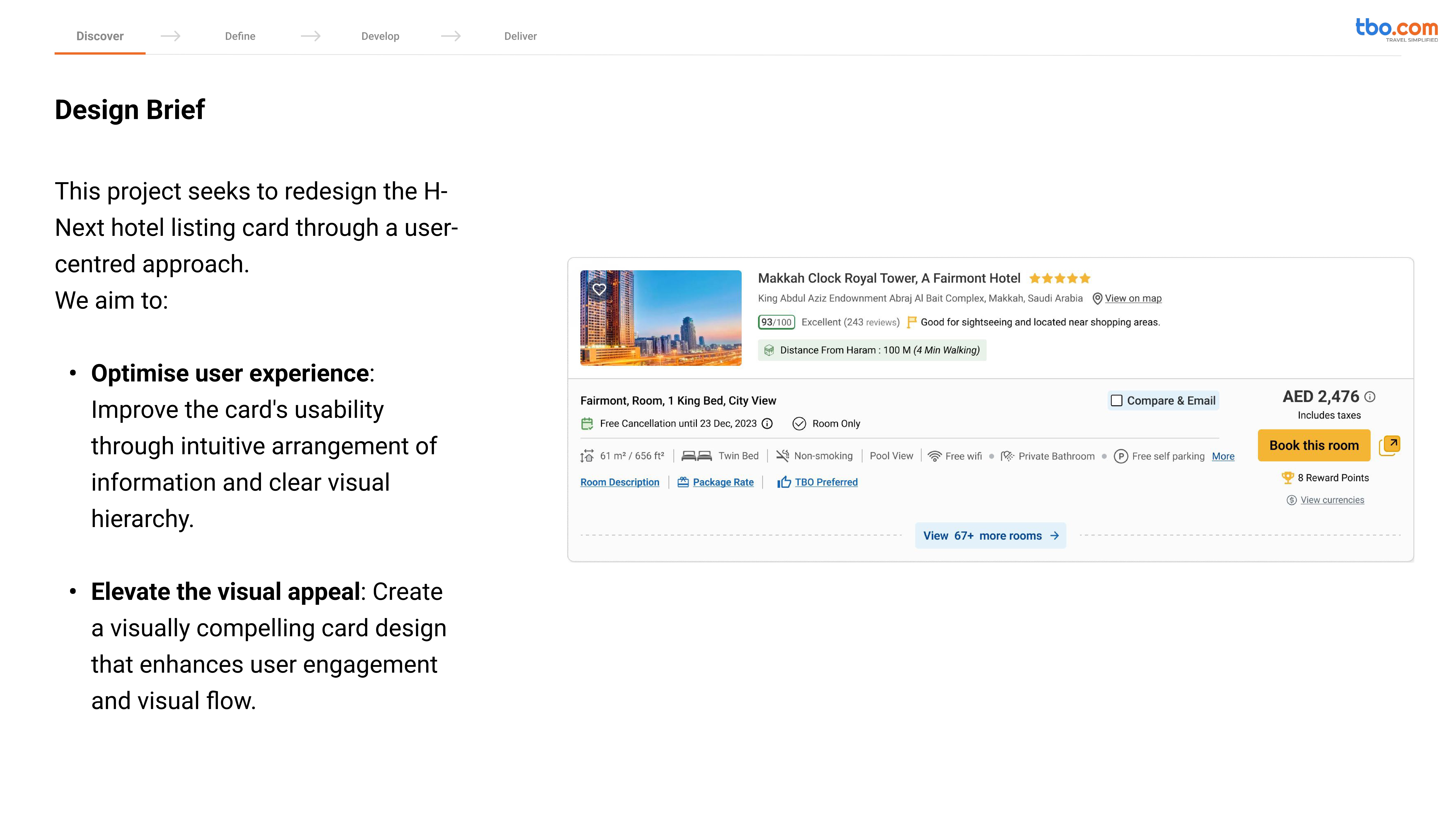
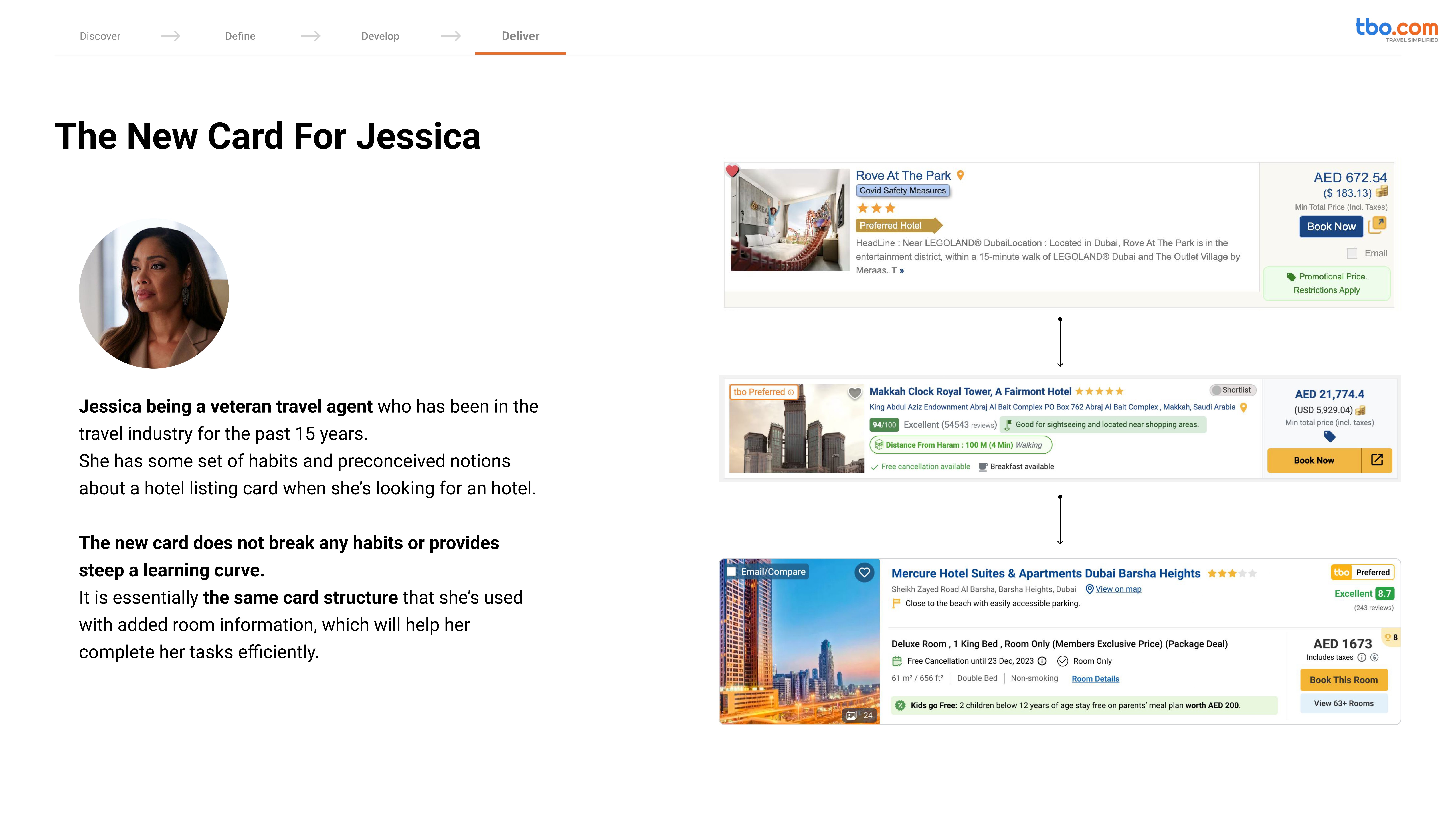
The H-Next Usability Study was a collaborative, user-centered design initiative focused on redesigning the hotel listing card on TBO.com — one of the most critical touchpoints for travel agents booking hotels for their clients.
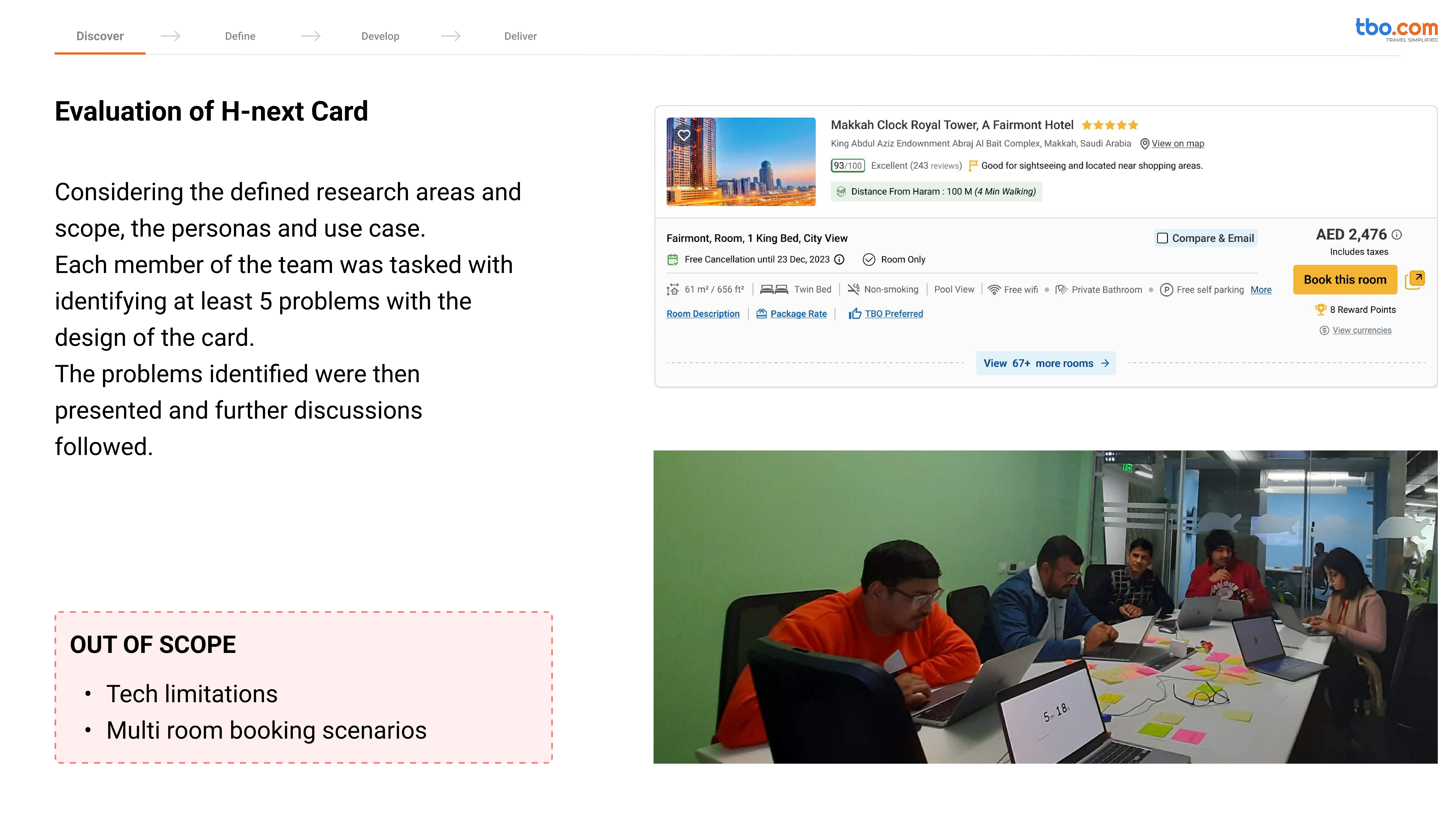
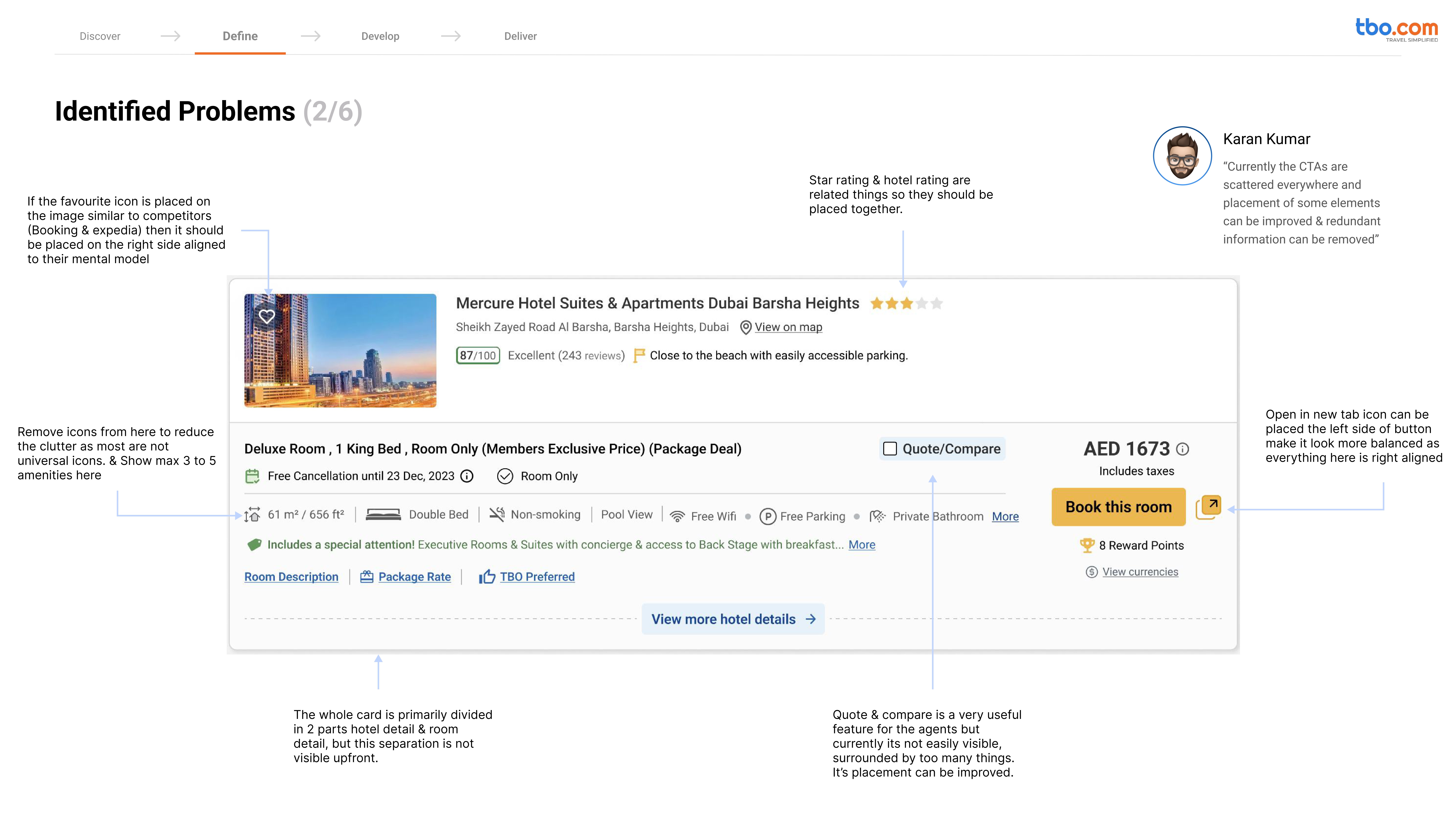
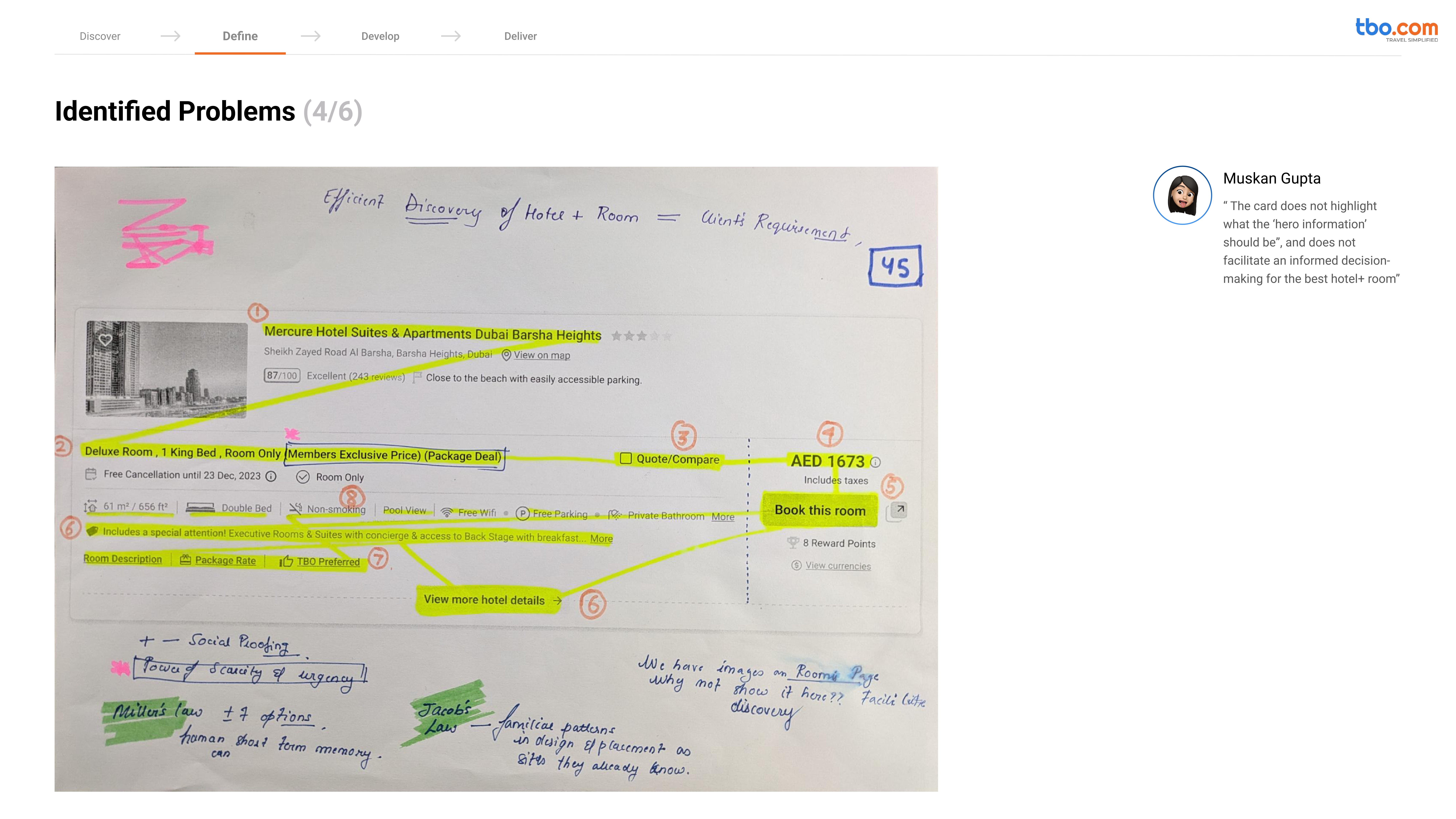
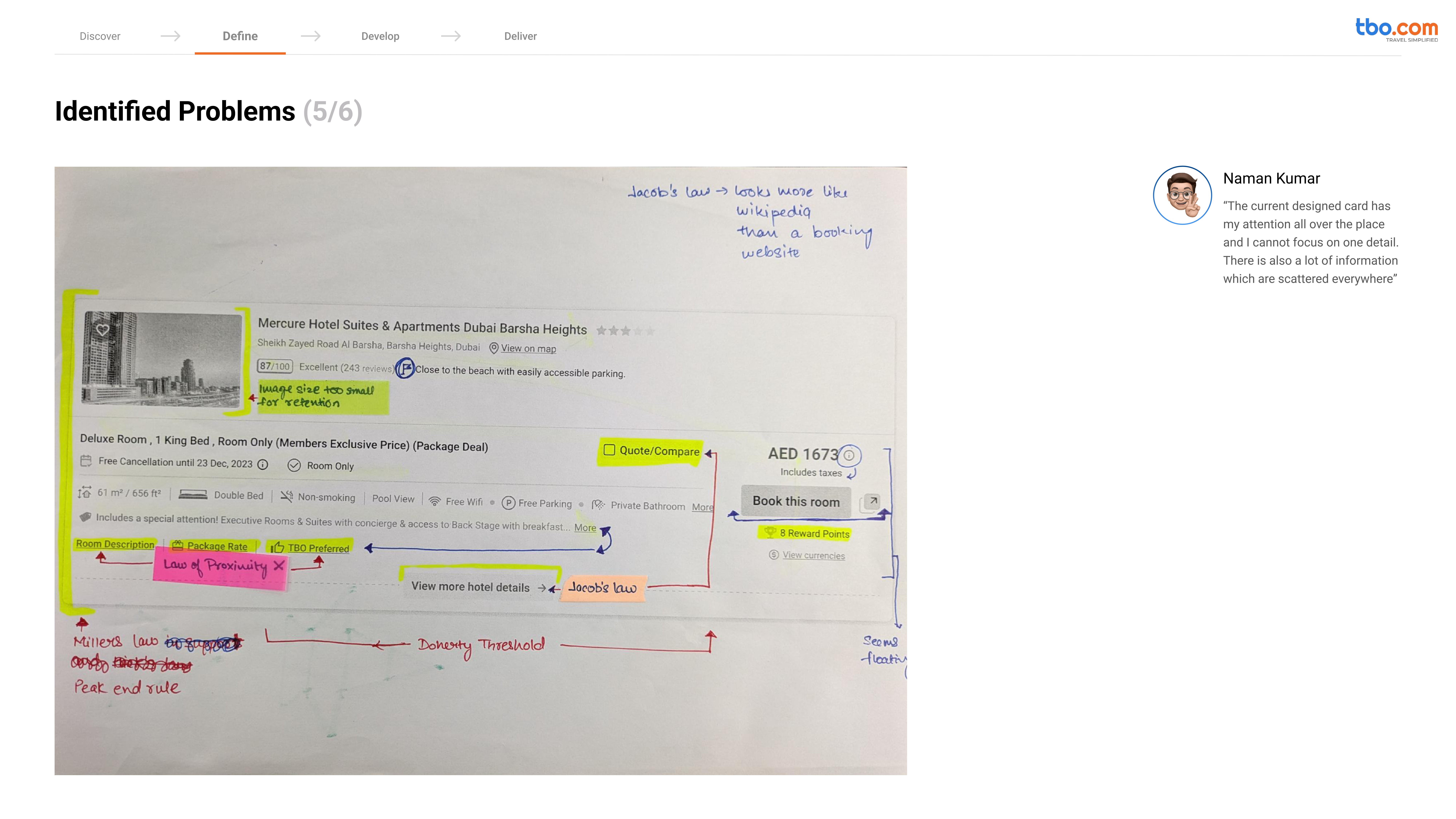
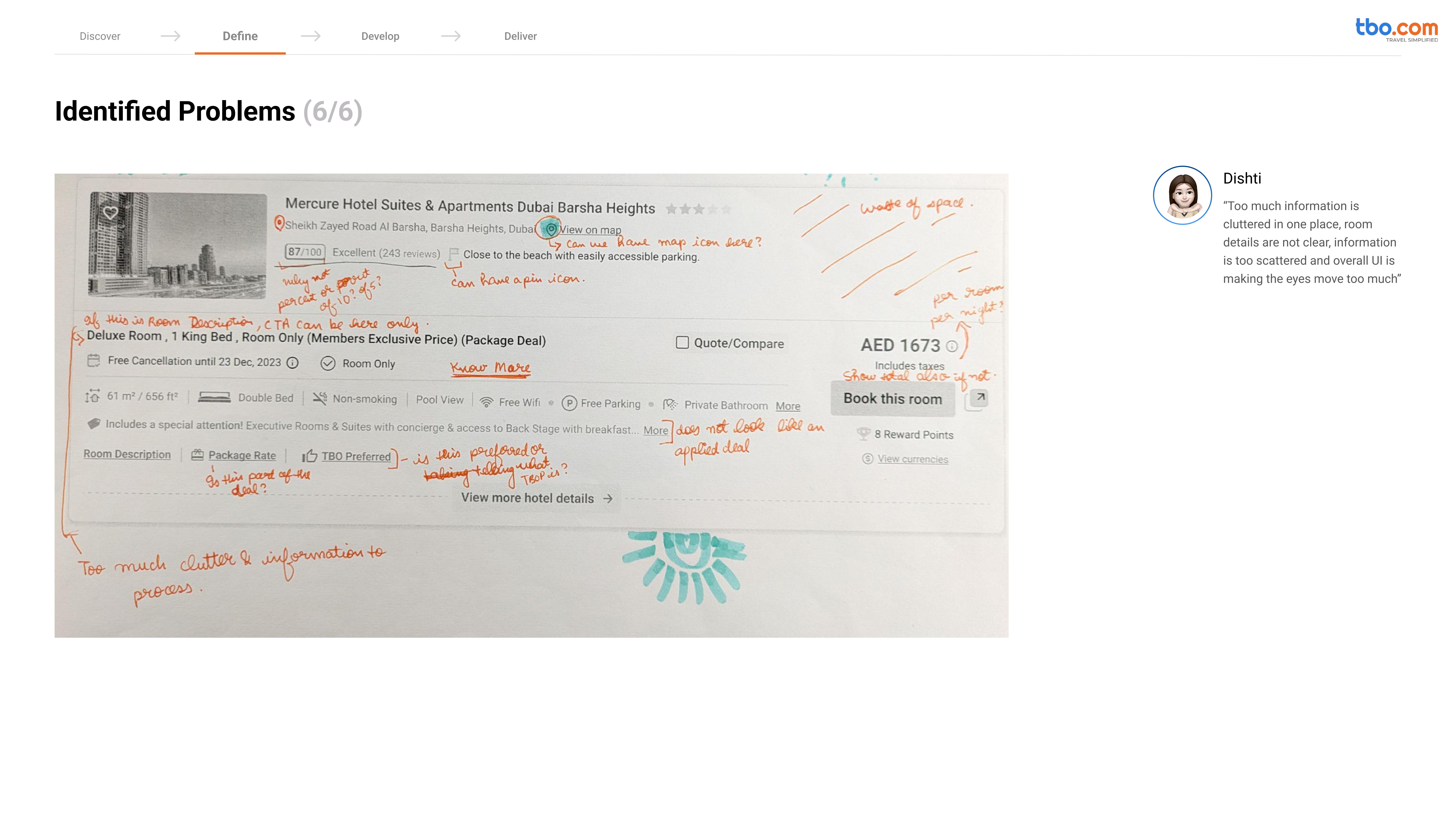
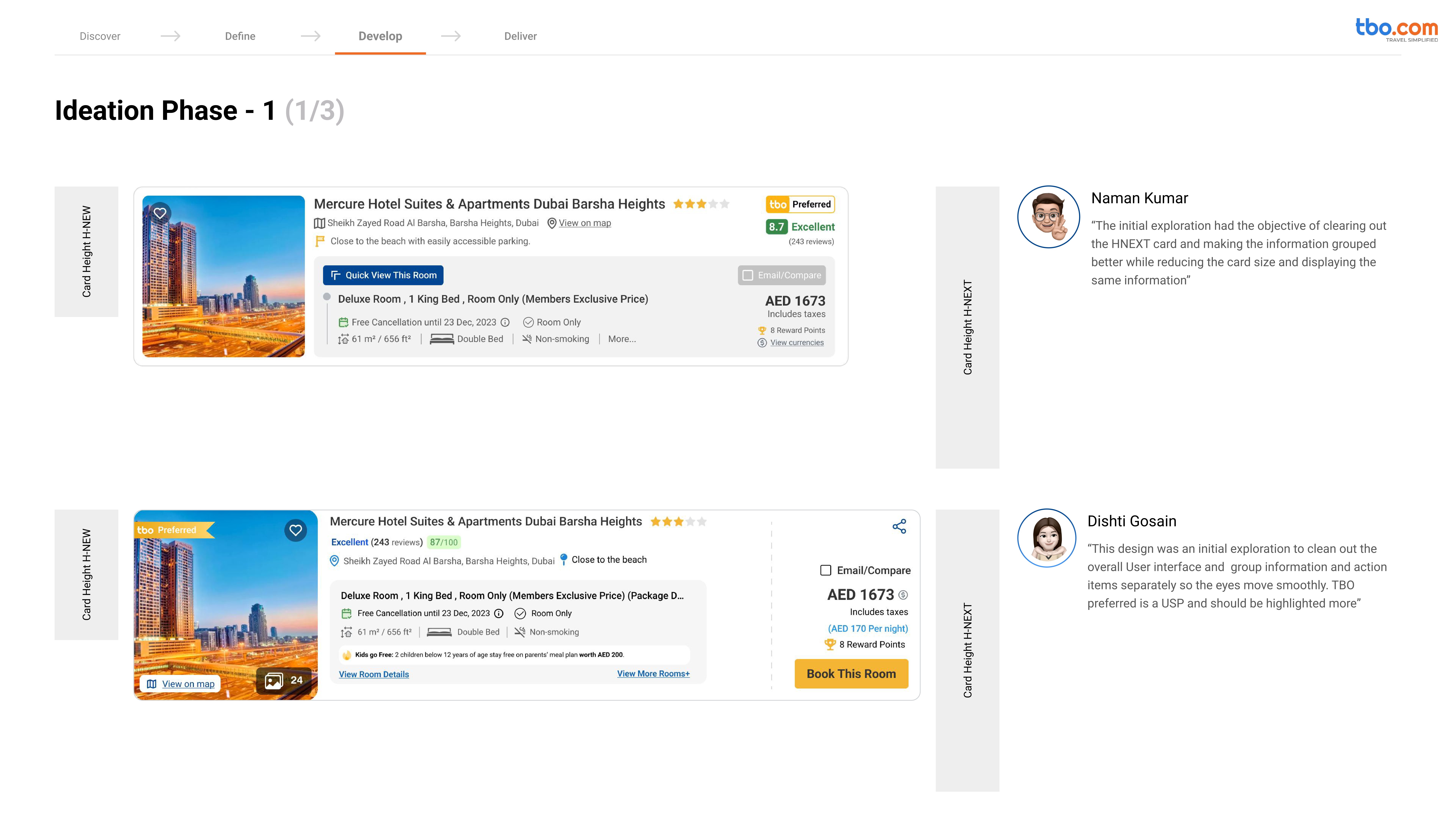
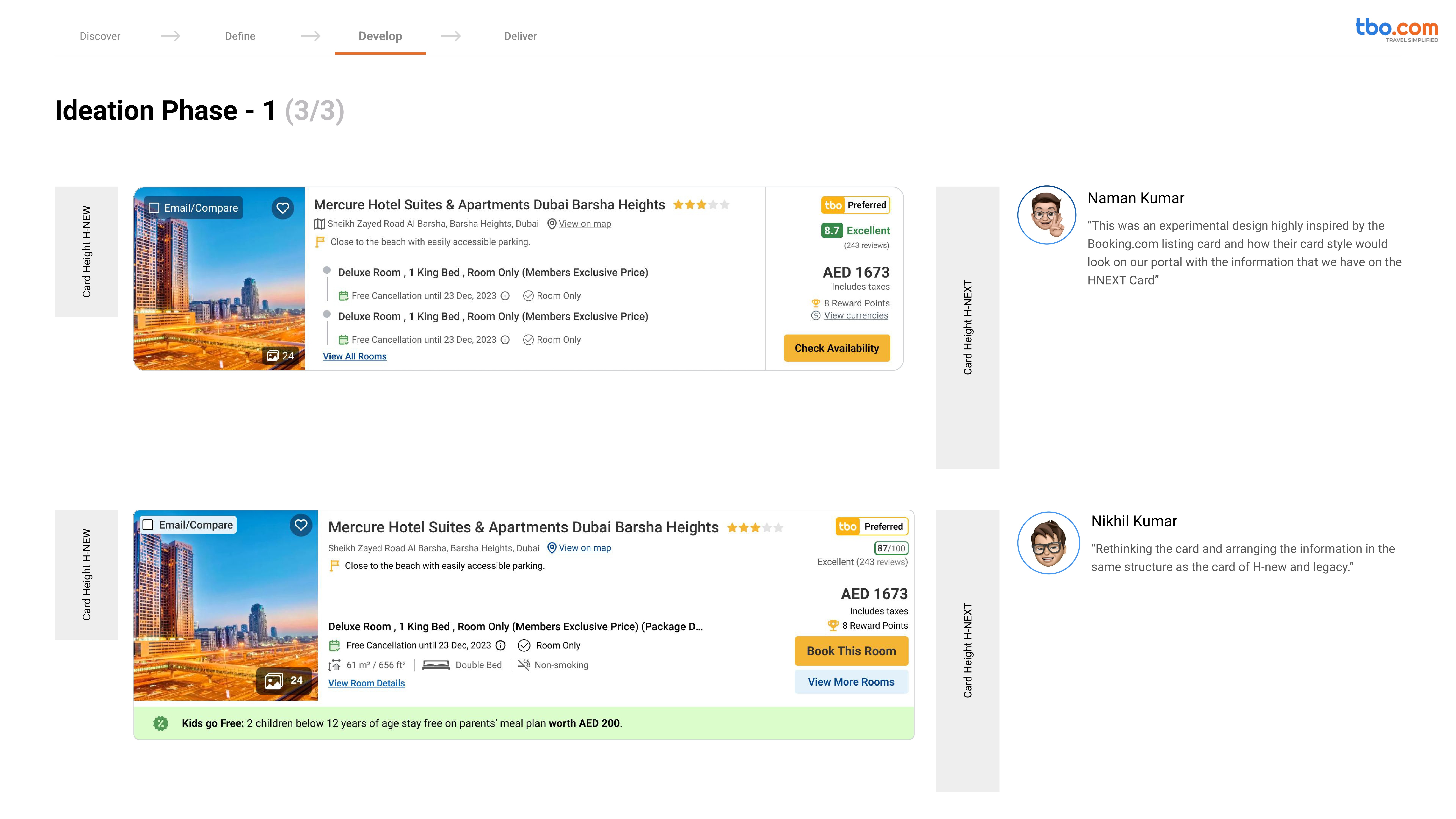
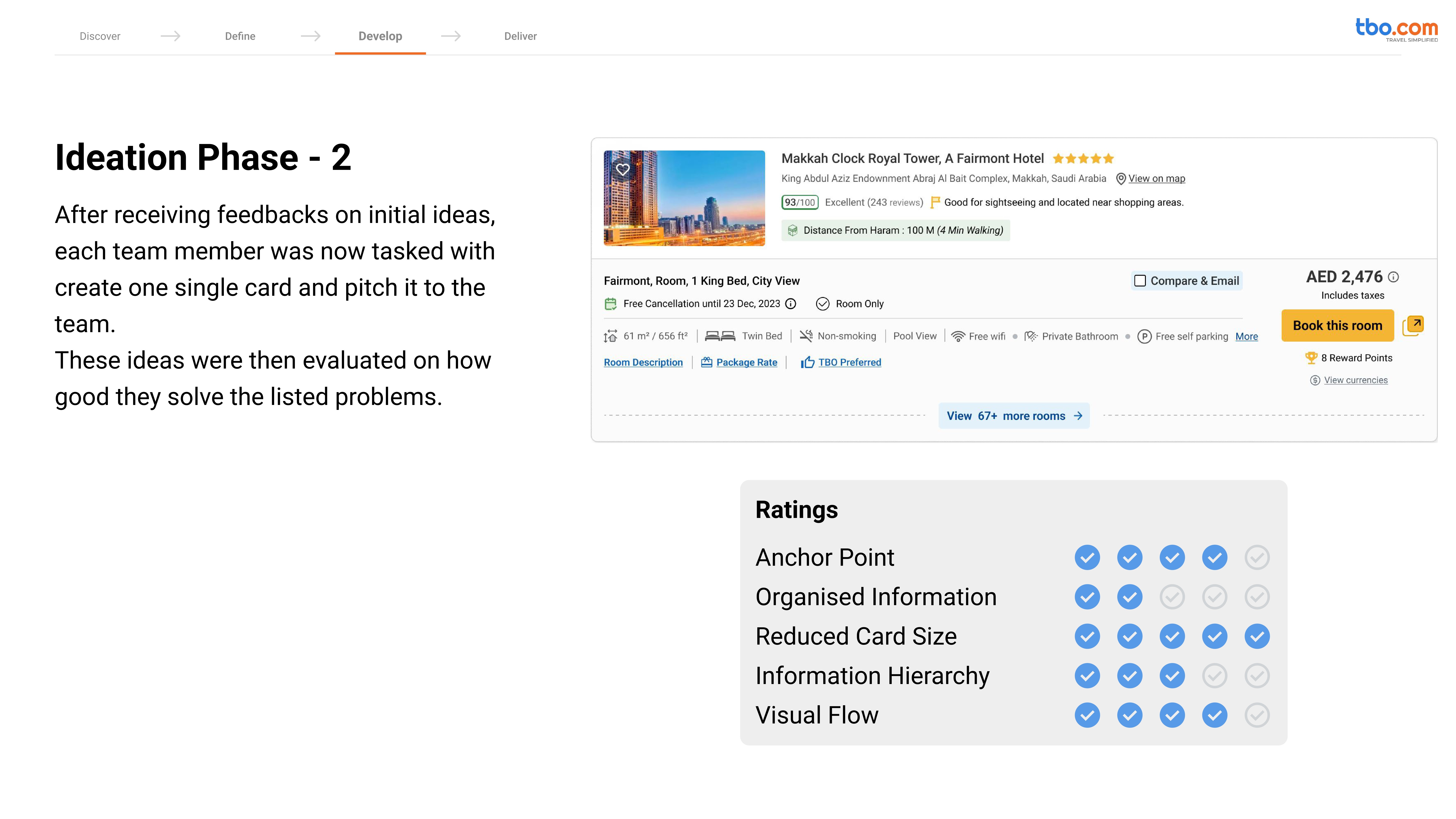
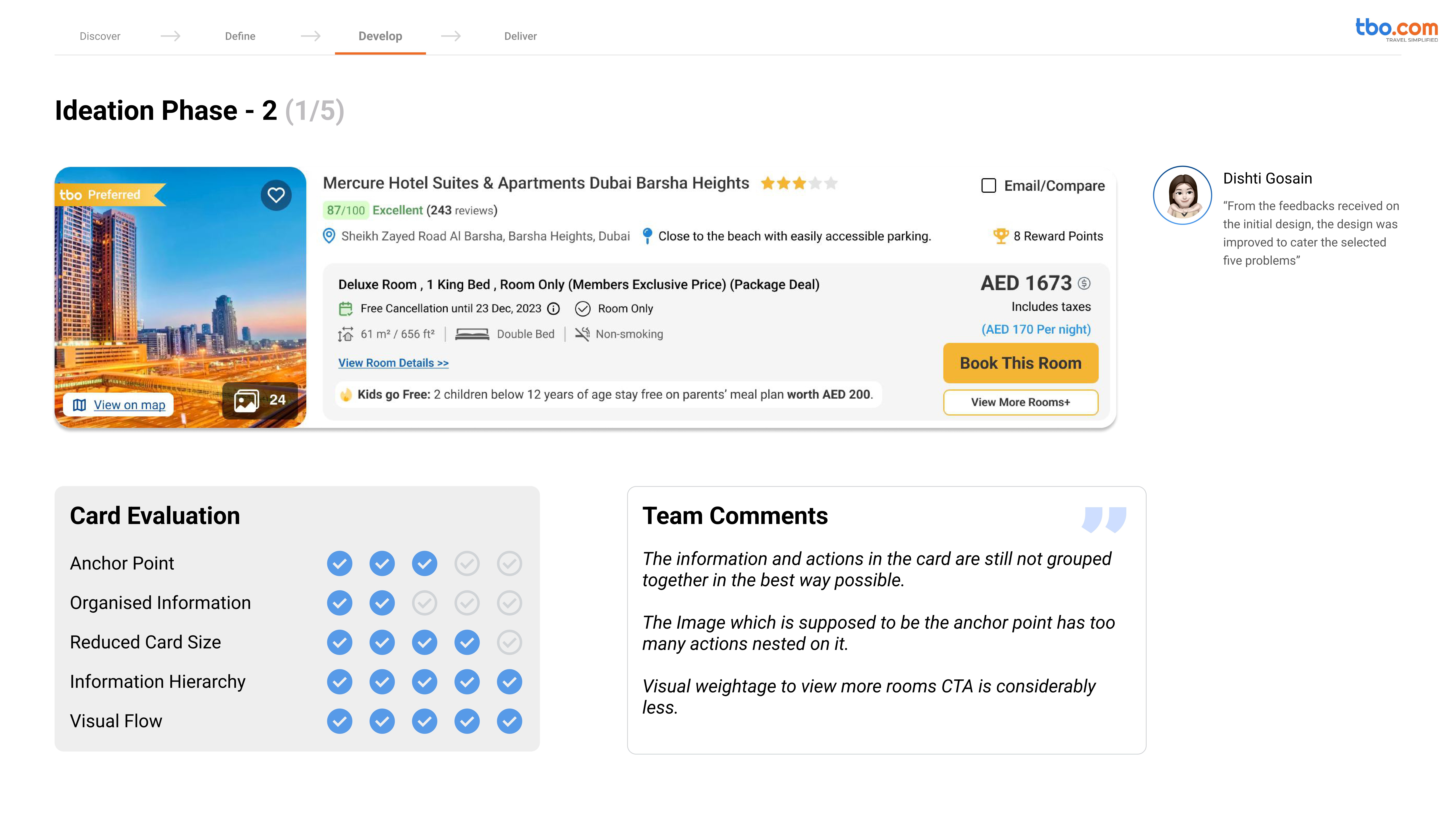
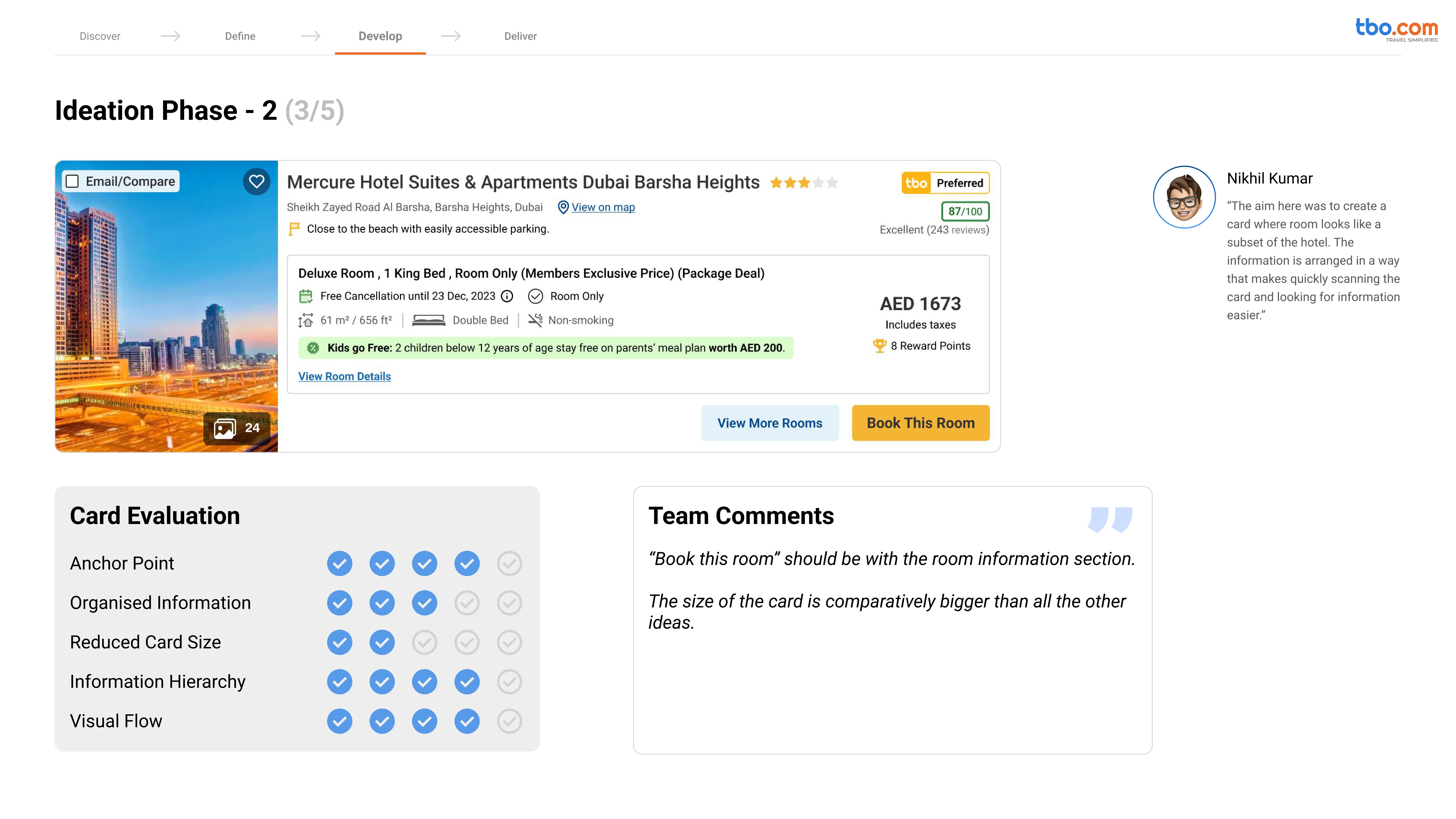
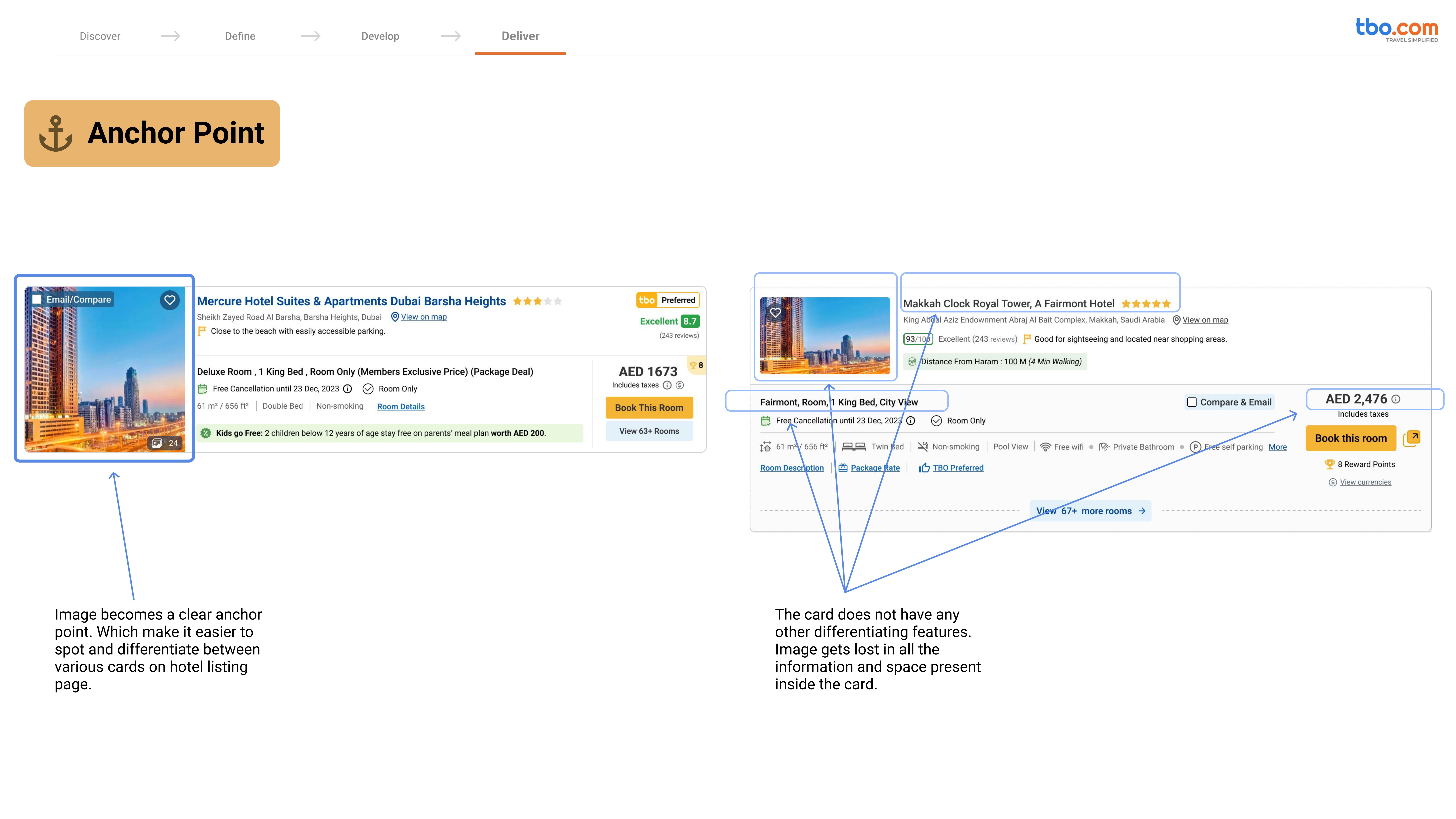
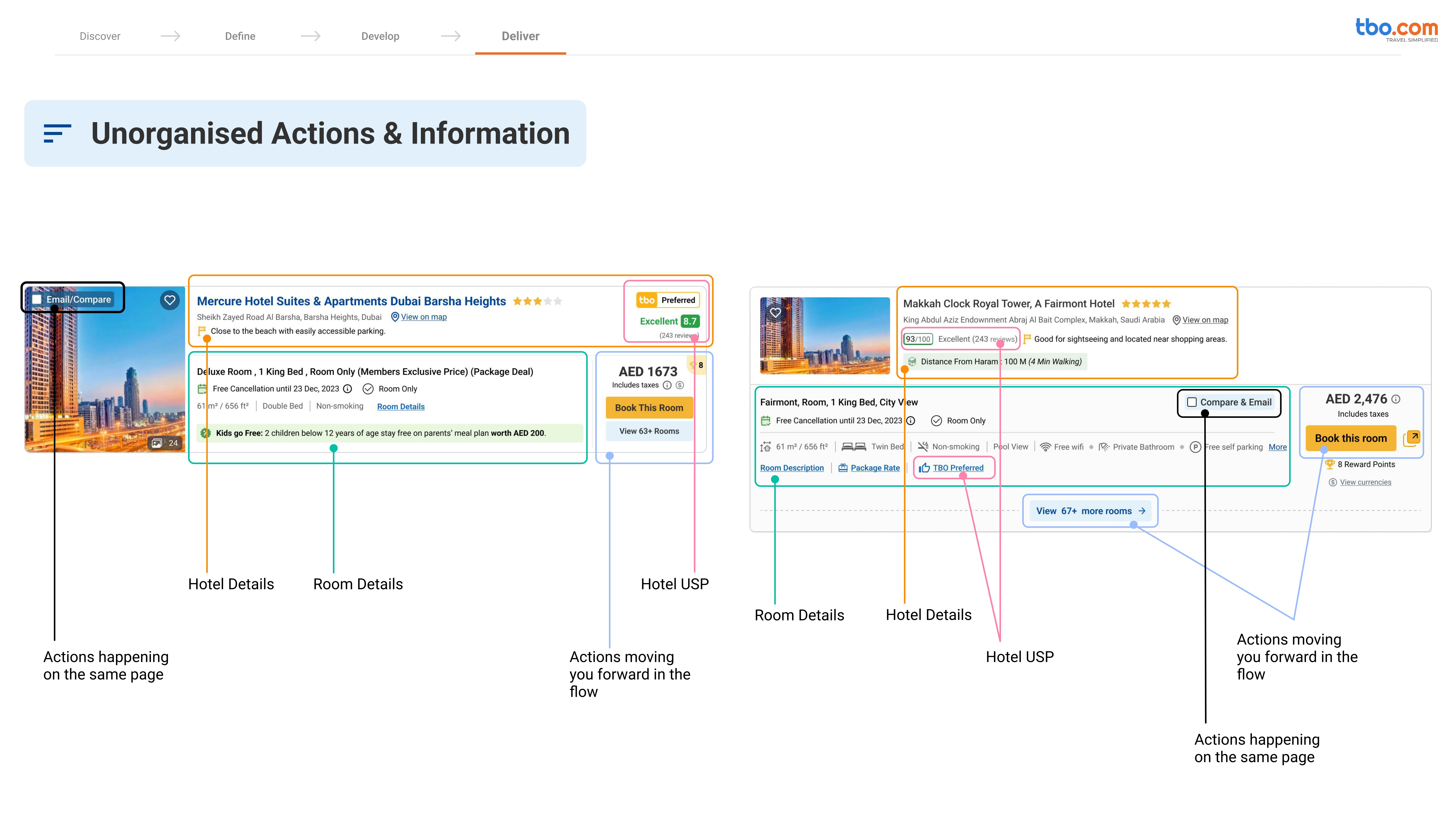
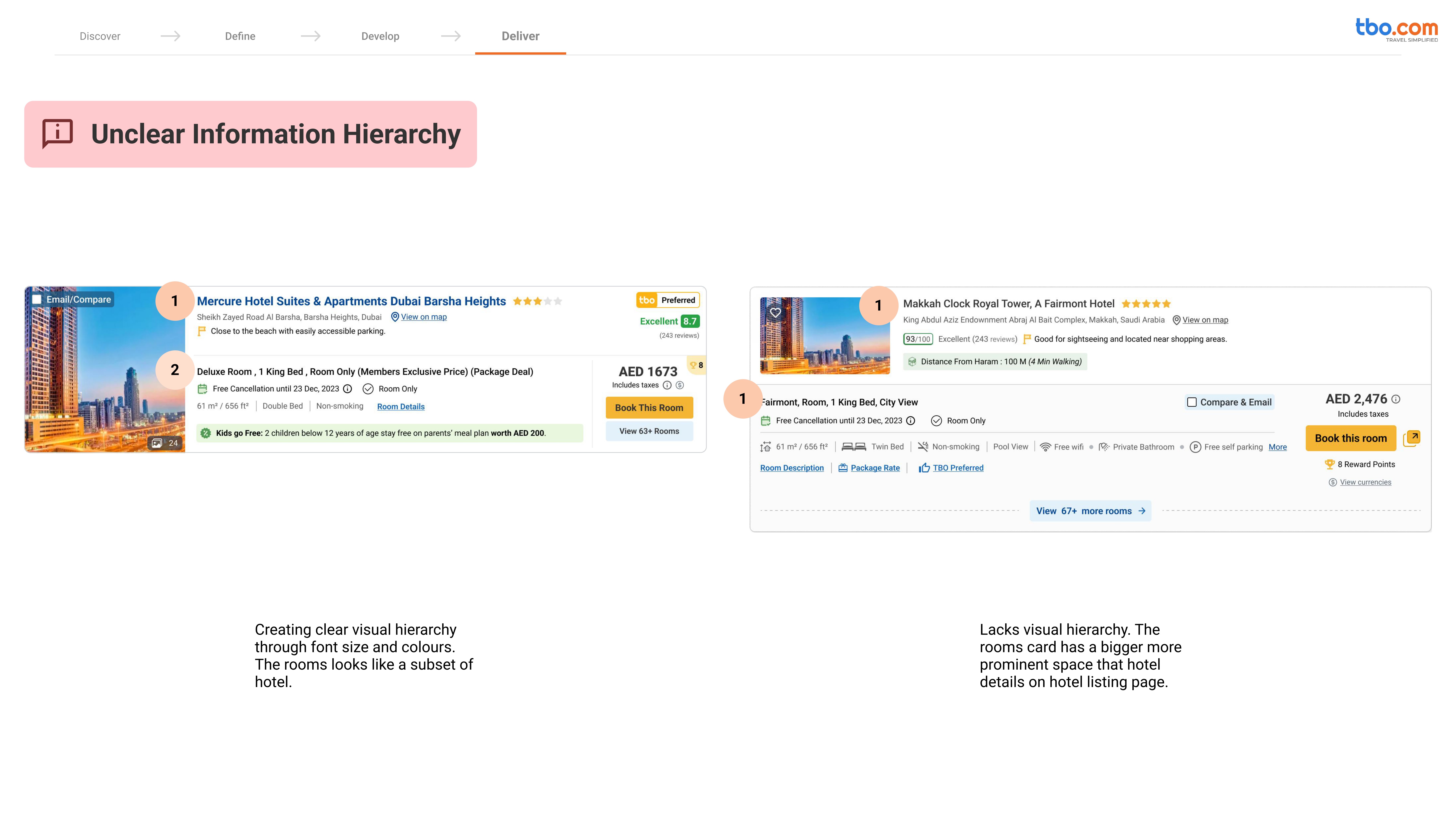
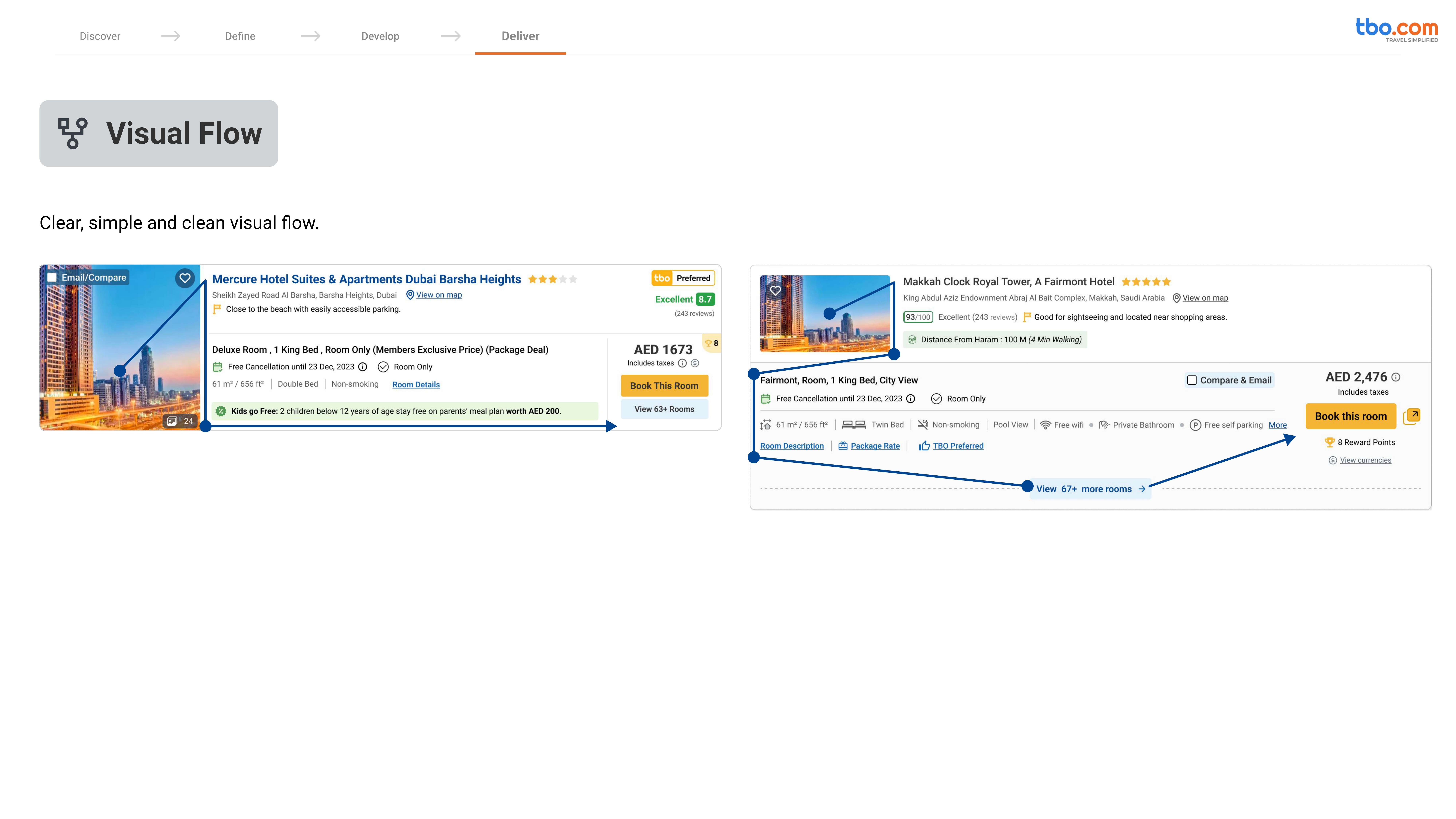
As the lead designer, I defined the problem statements, set up the research framework, led the usability exercises, and guided the team through insight synthesis and redesign directions. The goal was clear: enhance clarity, scanability, and visual flow without disrupting how agents already worked.
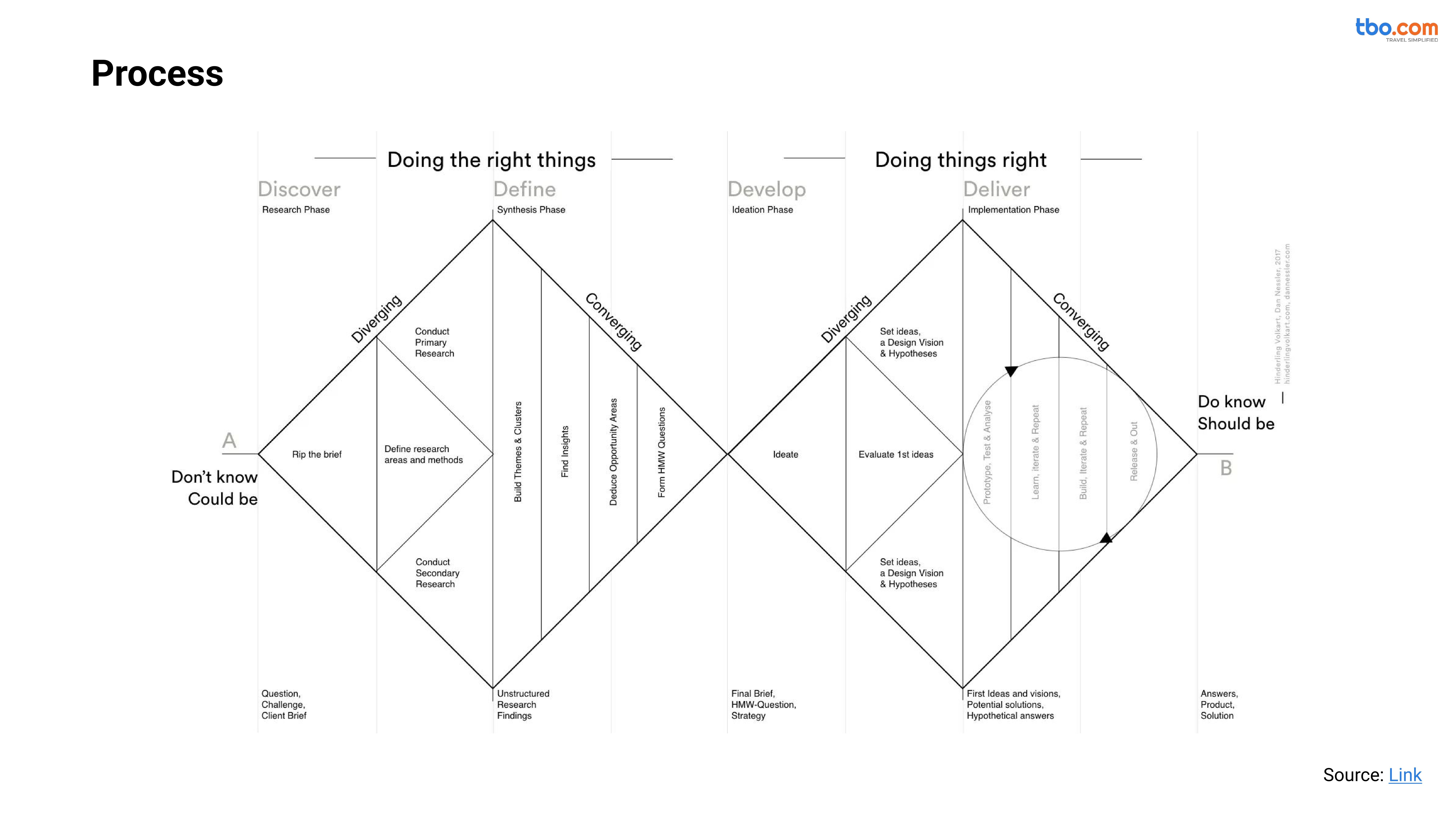
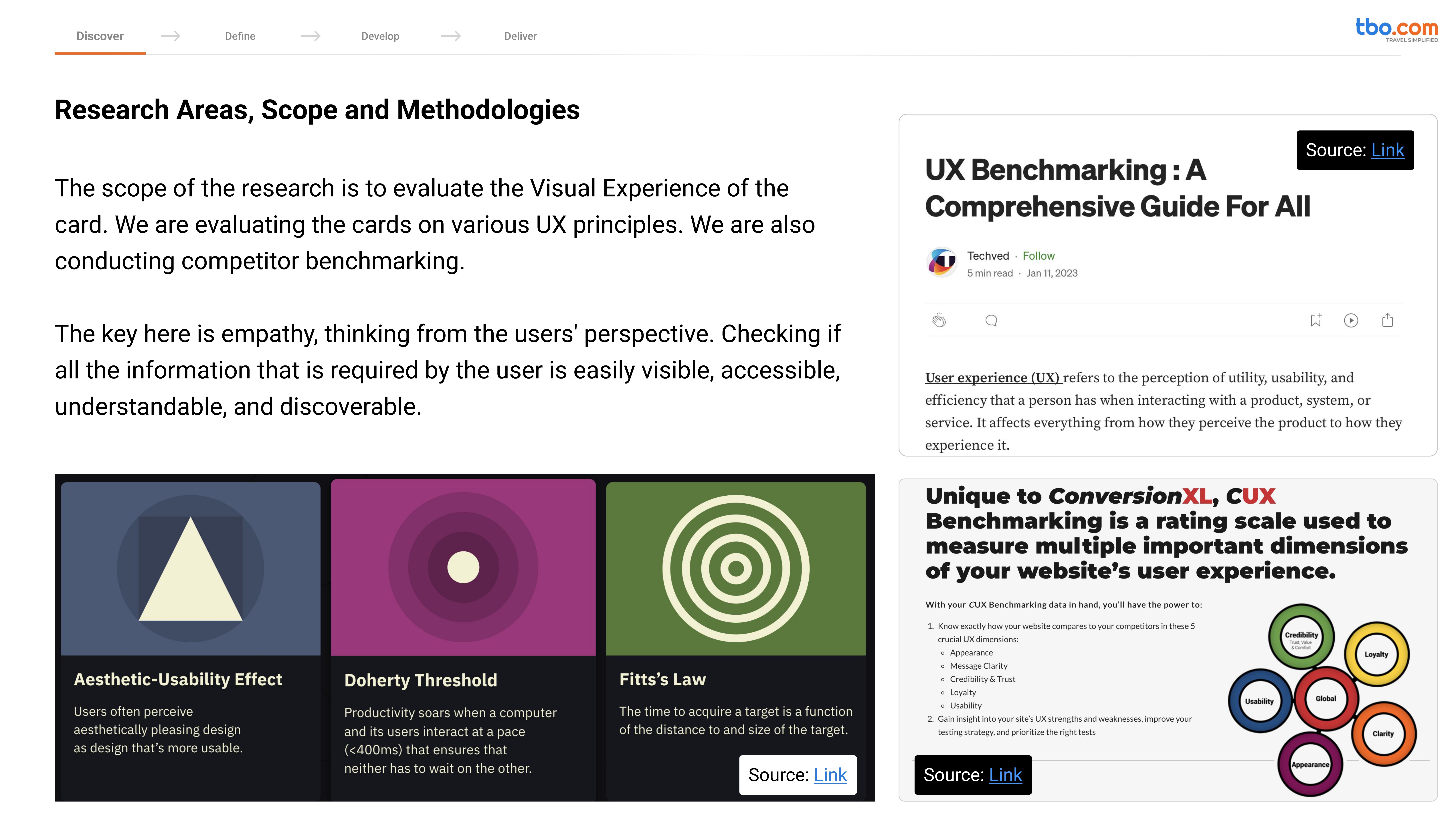
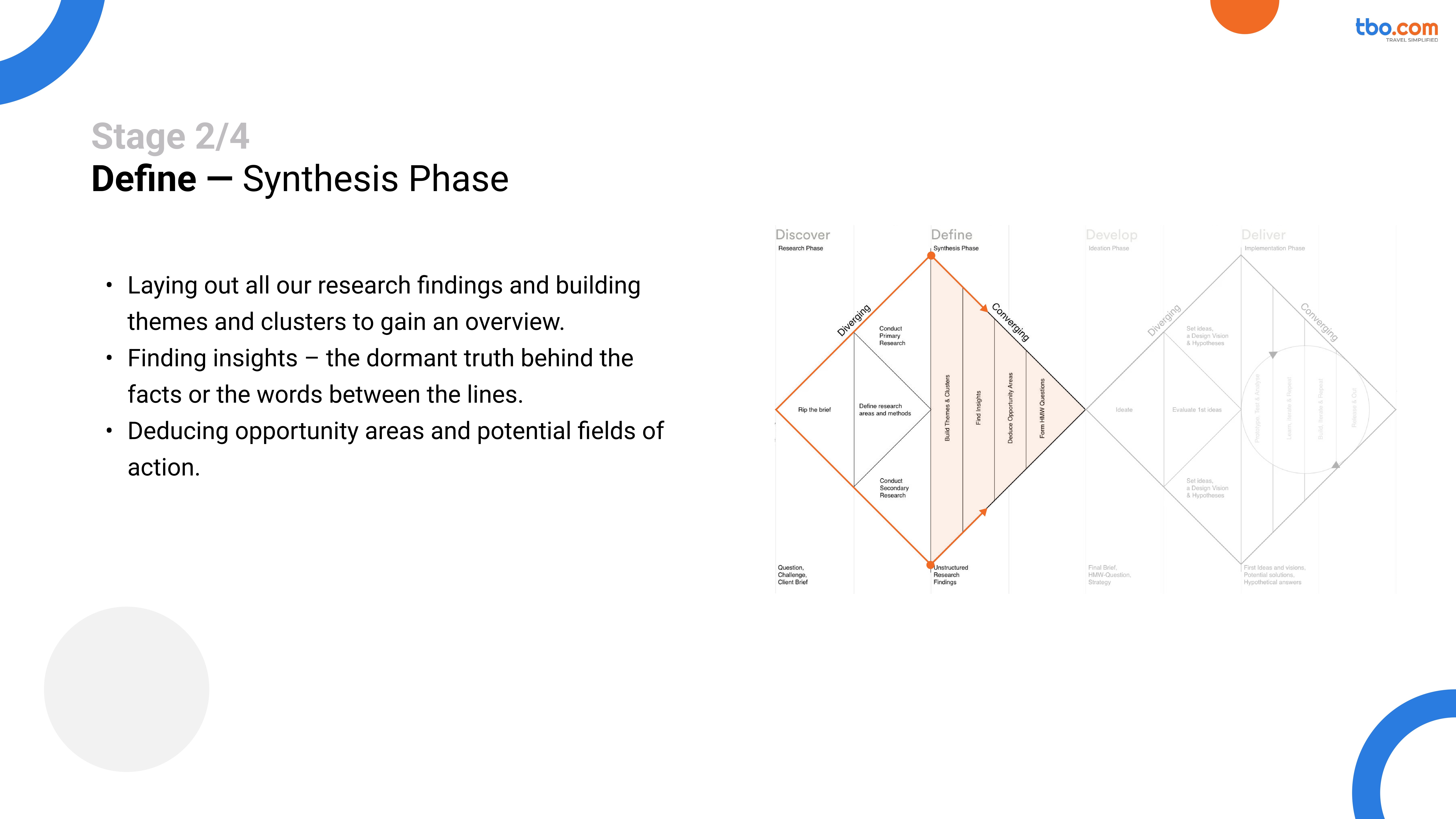
This study ran over six weeks, combining moderated usability sessions, A/B benchmarking, and quantitative feedback analysis. Together with researchers, product managers, and developers, we explored how visual hierarchy, content grouping, and cognitive load affected decision-making and booking speed.
The study not only informed the final H-Next card redesign, but also created a repeatable usability testing framework, one that shifted how TBO evaluates and iterates on key UI patterns.
[Industry]
Travel: Hotel Booking
[My Role]
Lead UX Designer
[Platforms]
Desktop
[Timeline]
2 weeks
Key Outcomes
40% improvement in task completion rate for users identifying key hotel details (price, inclusions, and cancellation policy).
26% reduction in average scan time, improving the ability to compare properties at a glance.
42% increase in perceived trustworthiness, based on user feedback scores post-redesign.
Over 70% preference rate for the new card layout across both novice and experienced agents.
A unified set of design heuristics for future product card components, adopted across multiple teams.








































Key Challenges and Takeaways
Running this usability study reminded us that clarity isn’t just a design goal; it’s a continuous practice. Testing early prototypes with real agents uncovered not just UI friction, but behavioral patterns that reshaped how we thought about task flow and efficiency.
We learned that:
Small issues add up fast. Tiny inconsistencies—button placement, unclear hierarchy, copy tone—created measurable drops in task completion. Fixing them boosted both speed and confidence in the interface.
Observation beats assumption. Watching agents struggle with steps we thought were “obvious” reinforced why every flow needs validation before scaling.
Consistency builds trust. Agents were more forgiving of missing features than of inconsistent layouts or labels. Visual and interaction coherence directly correlated with perceived reliability.
Iteration is strategy. Each test cycle didn’t just fix screens—it influenced the roadmap, helping prioritize changes that brought the most impact for the least disruption.
The study ultimately proved that usability isn’t about perfection—it’s about progression.
When design teams test, listen, and iterate often, every release becomes smarter, smoother, and more human.
Your screen’s great, but the desktop version is even better.

